Tuesday, 8 October 2013

The Box

As previously said, we have chosen to make our box of water out out bioplastic as opposed to regular petrochemical plastic to help the environment. However, when considering the use of bioplastics, we also have to consider the limitations that this may have when branding our product and we need to find ways around these negatives.

We have already decided that we don't want to have a plastic film wrapped around our bottle as we feel that this would go against being environmentally friendly and would make the use of a compostable bioplastic completely pointless. Therefore we need to find another way to brand our bottle with our name, logo and all other necessary information. We have looked into the idea of engraving into the bioplastic, however after doing some research we have found that this may not be that easy, especially as we would like to have a colour engraved into the clear plastic.

http://science.howstuffworks.com/environmental/green-science/future-of-bioplastics2.htm
http://www.chemanager-online.com/en/topics/chemicals-distribution/colorful-world-bioplastics

The production of bioplastic can be up to 100% more expensive than the production of petrochemical plastic and although we have no actual budget, we would like our idea to be as realistic as possible. We would be happy to spend slightly more money in order to make our product eco-friendly, however we feel that adding colour on top of this would be unrealistically expensive. The production of colourful bioplastics is also quite difficult and can limit the compostable features of the plastic so because of this, we will start to look at other ways to add colour to our clear bioplastic box.


Another option, which we have briefly previously mentioned, would be to use a transfer/sticker directly onto the box with our branded logo on it. We hadn't before considered this idea in depth as we were thinking of using coloured plastic but after deciding that coloured plastic wouldn't be feasible we have done further research into this idea.


We like the simplicity of each of these designs and how striking they are and because simple is one of our brand values, we feel as though this would be a good way for us to design our water brand.  The colours in the logo are emphasised more because they are clearly and cleanly presented on the clear bottle, helping to emphasise the brand. 


After carrying out further market research, we have come across another issue that we feel needs to be addressed. We want a water brand that will stand out on the shelf amongst the current water bottles so that consumers will want to buy it and designing a box shape as opposed to a standard bottle will stand out quite a bit and give our brand something unique. However, because all of the bottles/our box will be made of plastic, they will all look quite similar and we don't feel as though it would be unique enough. Therefore, we have started to rethink the material that we use. 

We have previously considered paper/cardboard cartons but went against this idea because we felt as though consumers wouldn't like not being able to see the water inside. However, after reassessing, we thought about how juice and milk are sold in cartons and it doesn't seem to bother consumers, so why should it with water? Using a paper/cardboard carton would still be in keeping with being eco-friendly and it would also solve our issue of getting colour onto clear bioplastic that was proving difficult and expensive. Even though this idea goes against our first research findings, we feel as though having a brand that stands out and gets noticed most is more important than being able to see the water inside. 

Although we like the idea of using a carton design, we have already started designing a square box and want to stay with this idea as we really like it and like how our logo could look on it. Creating a paper/cardboard box of water would be totally different to anything else that is currently available and would really give our brand something extra which would help give it a unique selling point.


A typical shelf-stable carton is made of 3 things;
  • 74% paper
  • 22% plastic
  • 4% alluminium

A typical refrigerated carton is made of only 2 things;
  • 80% paper
  • 20% plastic


We think that a refrigerated carton is the best type of carton for us. We have decided this because a refrigerated carton is as we believe, more eco-friendly. When each of the materials are broken down separately, aluminum has the least purpose and therefore we feel as though it isn't a necessary material. 
  • Paper - Breaks down into paper fibre that is used for tissues and office paper.
  • Plastic - Breaks down to be used for shipping crates and building materials.
We would use the plastic and paper combination that makes up a refrigerated carton, however we won't use the standard refrigerated carton shape, we will use our own designed box. 

What Colour?

Since we have started thinking more about the design of the bottle and our logo for it, we have started to think more into the colours that we could use. As previously said, we have gone against the idea of using an opaque material for our bottle as customers will not be as interested as they won't be able to see the water inside. However, we would like to use a bit of colour on our bottle design to keep it interesting, fun and eye catching so we are thinking about using a transparent plastic for most of the bottle but to then have either opaque coloured plastic or clear coloured plastic engraved into it for the logo. Even if we used an opaque colour, it wouldn't interfere with being able to see the water as it would only be used for a small part of the logo.


We are yet to decide which colour/colours to use on our bottle however, we hope that which ever colour/colours we choose, they will work well together on our bottle and will stand out and emphasise our logo like the following examples.


Some of these examples show the coloured logo on a plastic film wrapped around the bottle or a coloured transfer straight onto the bottle. We have chosen not to use a plastic film around the bottle to save on plastic and remain environmentally friendly. We haven't yet thought about using a plastic transfer directly onto the bottle, but this may be something we look further into if we decide that engraved coloured plastic isn't going to work on a clear plastic bottle. 


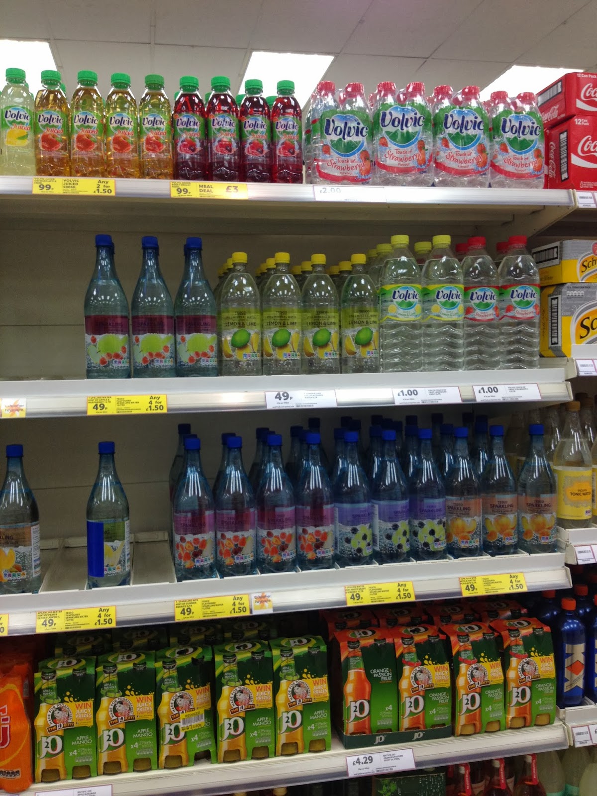
After visiting supermarkets to research the different water bottle brands that they had on display, we realised that a lot of water brands use blue, red and white to brand their waters and give them strong colour branding. We feel that blue is an obvious choice for a bottled water brand because blue automatically has connotations with water, so because of this, we don't want to use blue. Green and purple are also used on some bottled water brands such as highland spring, however, this isn't as common and we think that these colours work well together in helping to make the bottle stand out on the shelf. Even though we won't be having a completely coloured bottle, it is interesting to see how much colour can stand out amongst clear plastic. 


We want a colour that will express the meaning of our brand and help convey our brand values. 
  • Garden of Eden 
  • Heavenly and Blissful 
  • Fun
  • Healthy
We want a colour that is going to express all of these meanings eg. green would be a good choice for Garden of Eden and yellow would be a good choice for Fun. However, we also want to look further into the meanings of colours to see which is best for what our brand represents. 

Blue
  • Natural
Red
  • Energy
Green
  • Eco-Friendly
  • Natural
  • Balance
  • Restful
  • Soothing
Yellow
  • Fresh
  • Energy
Orange
  • Health
  • Thirst
  • Youthfulness


All of these words have some connection to our water brand and what our brand stands for and each word has a adjoining colour to represent it, so we will now have a play around with these few colours and see what works best for us.


As our most recent designs show, we have narrowed down our choice of colours to orange and green. This is because both of the colours are really eye catching and would draw consumer attention to our brand and also because neither of these colours are used a lot for water brands, this will help make our brand stand out even more. We also really like what that these colours represent as they are relevant to our water brand such as eco-friendly, natural, balance, restful, soothing, health, thirst and youthfulness. We then had an experiment with these two colours to work out which shade to use.


After further designing and combining green and orange into one logo, we have decided that its too over complicated and doesn't emphasise our logo and name as much as we would like. Therefore we would like to use just one colour and we have chosen to use green instead of orange because we feel that orange is too associated with orange flavoured drinks and this may cause some confusion. Whereas green isn't associated with a specific colour and is more associated with fresh, natural and eco-friendly which is suitable and relates to our brand really well.

Thursday, 3 October 2013

Bottle or Box?!

As previously mentioned, after getting inspiration from 'Boxed Water Is Better', we have been contemplating with the idea of designing a box of water as opposed to a bottle. Boxed water is much more environmentally friendly and sustainable than plastic bottled water. However, we had a worry regarding the boxed water in that you cannot see through the packaging to see the product inside and that customers buying this water will want to see what it is that they are buying. Therefore, we did a bit of market research and asked the opinions of our family and friends and from this found that opaque boxed water wasn't a good choice for us.

However, we were very interested in the box shape as we felt as though it was unique and would stand out amongst the standard bottles as currently there is nothing like this on the shelf, as we found through our research from visiting a range of shops.


So we then thought about designing a transparent plastic box as opposed to an opaque paper/cardboard box but we wanted to try and keep it environmentally friendly so have looked into biodegradable and compostable plastic. We have done some research into bioplastics and looked into the differences between compostable and biodegradable and have decided that using a compostable bioplastic would be the most environmentally friendly for us.

Compostable Bioplastics

  • Are derived from renewable raw materials such as starch, protein, soy etc.
  • Are not hazardous/toxic in their production.
  • Decompose into carbon dioxide, water, biomass.


http://earthcycle.com/blog/2010/02/05/compostable-vs-biodegradable-%E2%80%93-what%E2%80%99s-the-difference/
http://worldcentric.org/biocompostables/bioplastics

Tuesday, 1 October 2013

New Brand or Re-brand??

We either have the choice of rebranding a water brand or create a whole new one?! This is a question we have been asking our self's.

We came up with ideas of how we want the brand to be or represent:


  • Environmentally friendly
  • Message in a bottle
  • Raising awareness 

We liked these few points as this could all come together as a campaign for the brand, however we don't want to focus just on one at such an early stage.

For the brand we thought we could stay away from the idea of the plastic bottle and come up with something different however we also have to think that the typical plastic bottle is see through so we have to keep it in mind people might want to see the water?


This is a good idea to have the water in a box, like wine in a box, this could be a different approach to the shape and a good selling point. This is a good way to stay away from plastic bottle's and when we went looking in shops at the bottle of water section this is not seen at all! 
This boxed water is more sustainable than plastic bottles, 76% of the box is from renewable source, trees. 
  • 10% of the profits go to world water relief foundations 
  • 10% of the profits go to reforestation foundations

On the packaging there is nothing that say's its luxury or a speciality it simply is just a box of water.

Another example of boxed water! 


This is a new packaging from Brandimage who are a concept development, branding, prototyping, engineering, product design agency.

This 360 paper bottle is the first environmental friendly solution to plastic bottles that are easily transported: 

  
This is a sustainable vision of the future which is made by 100% renewable resources, its uniqueness is it is made with 90-95% reduction of polymer, you tear of the top which separates to become a re-seal and its made from 100% renewable resources.
We think this is a good idea however the material might be hard to design with such as certain colours or logo we want on it?


Our Brand


We have decided to go ahead and create a brand new water brand, we thought this was going to be a bit more fun and we can raise awareness in a fun way.

  •  Water
  • Splash
  • Star gazing 
  • Clear
  • Drink it
  • Pure
  • H2o
  • Star gaze
  • Blue
  • Eau (water in french)
  • Pur (pure in french)
Here are some of the names we thought about, we looked into a variety of different names even words in French or other languages. We looked into names of rivers in Britain and we liked Aire, Lea, Eden and Ribble as we thought this could have a meaning to the brand and also keep it British.  

http://en.wikipedia.org/wiki/List_of_rivers_of_England


We chose the name Eden we liked the fact it had other meanings to the name and we could link this to a campaign for our water brand.

As we have chosen the name of our brand we then decided that our audience was to be universal as we didn't want it to be just on one type of person or persons. We did look into doing a brand for sports people, children, professional, charities or just general.
The universal audience reminds us of the Coca Cola campaign with the names simply because it involved and interacted with people. This is what we want for our brand so we decided instead of doing something that promotes charities or the badness in the world we want to promote the goodness that people have forgotten. "Awareness of the little things that make you happy"


Monday, 30 September 2013

The Beginning

For this branding project I have decided to work with an advertising student as I am interested in advertising and we both feel we could work off each other to learn more about each others area's.

We either like the idea of using an existing brand such as Cath Kidston and find a link to water or take an existing water brand and rebrand it. 

Here are some of the existing water brands that we have looked at:


These are some ideas we looked at that could give the brand a twist by being a bit different and maybe using a charity to bring something new to the design. 


Like the Coca Cola bottle's the new campaign for the summer really hit off as it made people have fun with the brand by finding names and names of loved ones. I think designing something that is personal for the buyer or have something like a charity involved in the brand will sell it. 

Just by thinking together we like the idea of a personal message or a message to represent something like using pink for breast cancer or a polar bear for global warming. I think something simple and easy design is more effective than say an overtop pattern even though this would stand out it would send out the wrong message. 

We have also thought about finding a way were we don't use labels, as this is a waste of material or a way around using plastic bottles? As this could be away around a new design or selling point to be different.