We have been focusing on the design of the bottle, so far we have decided it to be a box-square shape as this is different and unusual to have on the shop floor. Looking at different drinks packaging, we like the shape of the drinks carton however we would design a new lid so it's more like an everyday use bottle.
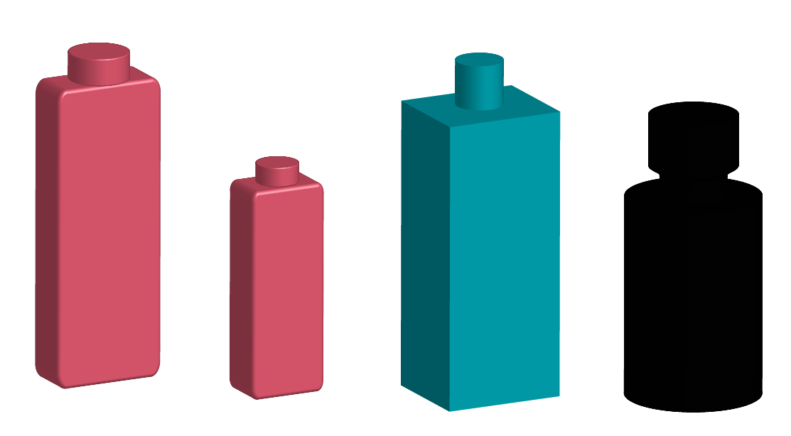
These are the first thoughts on the design of the bottle, they are just simple shapes that I have been playing around with. We like the shape of the pink bottle's but maybe have the depth of the blue bottle as we feel the pink bottle seems like a shampoo bottle. This is the first stage of the design however so this could change.


Starter Designs
Just to start visualising a bottle further I wanted to just get some shapes together on a page so we can pick and choose what we want to for our bottle. We wanted to play around with the design of the spout and how we wanted it on the bottle just because we don't want it looking like a carton.

Here are some shapes that represent the size of the bottles that we like. We decided that we like the thicker bottle as the thinner bottle seemed to remind us of another brand.


This is a 3D version of the bottle, it still needs more more work however I think this is a an improvement on the design as it looks more life like. We need to think of a logo and a design for the bottle and experiment with the lid and the size's. As this could be to tall or slim for our brand.
New Look and Logo
After doing some more research about the colours and the types of plastic we could use, this has changed our thinking of how our idea and look would be. As before we wanted to use a bioplastic to be enviromently friendly however this would be expensive so we are thinking more into this area.
However previously we have discussed the colours we want to use and looked into the meanings of what the colours mean. We have decided on the colours Green and Yellow as they mean fresh, natural and eco-friendly so this fits in with our name and what we want to represent. We like the idea of using the colour orange as this means health but if we are wanting to be simple we might need to be selective on our colours.
Here are some ideas for the logo, we wanted the word Eden written down the side as this is what our first idea was. I wanted to experiment with the idea of water droplets coming of the name, I had to be careful that the droplets didn't look to misleading or look like the existing brand Evian.
Here are some ideas for the logo, we wanted the word Eden written down the side as this is what our first idea was. I wanted to experiment with the idea of water droplets coming of the name, I had to be careful that the droplets didn't look to misleading or look like the existing brand Evian.


This design I wanted to bring what Eden really means into the logo, I chose a flower instead of using water droplets just because I found it hard to draw them so this was another idea I wanted to try out. I went on to develop this idea further by adding what could be water droplets I then edited down the amount of droplets as the design became more complicated which we didn't want.


I changed the Eden to have a drop down shadow to see how it would look but this has made the logo more 3D and off the page, which is a really good idea as it looks good off the flower shape and bold blue in the background.
After discussing this we came to the conclusion that this was to complicated and doesn't represent the brand well. We think if we change the background to a clear our logo will become more realistic, we also want take the logo back to basics and start all over again.
We want to try out our colours green, yellow and orange in the design and play around with what Eden stands for.


We really like this simple design on the bottle as it stands out and is different to what is out there. In my design above I wanted to try something more simpler with just one leaf at the top of the bottle as we thought this would be nice to have as the transfer stickers that we have spoken about and we can use more than one colour.
However after thinking about the design more I'm not sure this is the best way to go with the logo design.
A new design idea is to maybe add some extra words to the packaging? Maybe making the colours more a focus instead of using leafs?
These are something we have to explore next when designs.

Here I was playing around with some different shapes and ideas. However they don't seem to be good enough but good for starting points.

Here I was just starting to play around with the idea of adding extra words to the name so if we decide to do a carton we people will be able to read that its water instead of seeing that its water.

This was a new design for the bottle, I think this is a more simpler design and not something thats similar to other brands which we want. I have incorporated the colours yellow, orange and green in the design as the meanings represent the brand well.

Stripping back the design to just two strips of colour looks smart and is just a simple design and the orange represents fresh which is one of the words iv used as extra words.

Trying out what the design would look like with a lid.

After we both thought about the design a bit more we both felt we should test out the size of type and see how well it looked on a larger scale and more in the centre instead of the side like previously thought. We both still feel the fresh water coming off the E works well at this point. However we feel the lines might not work? We both have said that the lines could look like the river Eden which could be carried on around the box bottle, which we are considering.

Just to try out a different version we simply changed the colour to green.

Together we came up with the idea of changing the colour of the type instead of having a shape on the box. We decided that the mix of colours didn't work as well as we liked the idea of having the E stand out on the bottle.

This is way we then decided to make the fresh water black once again and see how the E would look just being in the different colour. However this again didn't stand out as well as the black did, as the E was a bold black it worked better with rest of the logo. Simply changing the colour of the E is almost expected?

As we still are unsure on the layout etc I started to play around with the positioning of the type and wanted to experiment with the spacing and the height of the letters as this might change the look. We also thought the fresh water next to E worked well like the words coming off the E, so we have a few possibilities.
As we were struggling to think how the design would look lifelike we created a few scrap versions and stuck them to bottles so we could maybe rule out a few of our designs or think of a few new ones.
As Harriet is much better at designing etc than I am, I haven't done much of it so far and I have done more of the research side of things, however, I wanted to try and help out with designs and get a bit creative so I had a play around with some colours and designs.

However, it is unlikely that we will develop any of these designs further as we have now decided to use just green instead of a mix of green and orange and we are also going away from using a leaf on our designs.
When we were playing around with ideas, we came up with the idea that we could have a one line of colour on the bottle we have said that green is the colour for our brand simply because orange represents orange flavoured drinks which we have said previously. We thought one line could represent the Eden river and this line could continuously fallow around the bottle.

My first attempt, for some reason the line doesn't look right on the first bottle however I think a less complicated line looks better. As we have positioned the logo on the bottle in many different ways I have chosen to see how the new design would work with each logo position.


When all the designs are together I think this design works just because it works well with the shape. I like how the line goes through the words and doesn't make the line look to staged and awkward on the bottle.
As previously said we did more research into the type of water Eden could be so my design needs to be updated to 'natural water'. However after discussing the newest design we are thinking of having the line more central?

Here I made the line central and changed the name to 'natural water'.

This I think has improved the look of the bottle and made it look a lot more together as a brand, simply because before with the logo on the side it looked liked someone had drawn the line on by accident. I think this is a good development to the logo and bottle.

Here I again moved the logo around so the line 'river' goes through the 'natural water' just to see what it looks like as we drew the design on rough paper.


As we both discussed we thought about keeping the E green as we liked this in a previous design, in the first design here on the left the way the E flows through the river as they are the same colour works i think as it again flows well.

More development on the logo, taking the idea of having the E in the green we thought maybe just changing the colour to a more darker colour might just make the logo stand out that little bit more so it doesn't clash with the line.

Just to see what the design would look like in the traditional colour of blue, as people still think blue as the colour of water, I wanted to try out our design in the colour. I do think this works and is the known colour however I do think the green is different and as we want our brand to stand we think green is the right colour. With the cardboard square bottle along with the colour green, I do think this is the right direction for Eden to stand out to the public. Yes people will properly think why have we done this to the design but people like different and interesting things. Sometimes change is good to everyday products, as they can start to look the same in different brands this is way we have made these changes.
As previously discussed we wanted extra wording on the bottle as we are having a cartoon type box we have thought more about this and we have decided to add still to the type of water 'natural still water' .

This just simply defines the type of water we are selling.

This is Harabara font.

This is Opificio font.

This PassionSansPDah font.

This is Opificio font regular.
We together like the first font Harabara as we like how the letters curve and aren't as harsh as say Thonburi which is what we were using perviously in the beginning of our designs. We like how the text is bold unlike the other fonts we looked at, however we do like the E being bold like the rest of the type, the fact its green as well just makes it stand out a bit more.
For the 'Natural Still Water' I kept the font simple so it would be easier for the public to read what the product is, I used the font Thonburi because when I was using this in previous design I grew to like the font and I thought it worked well with other stand out fonts.

This is the basics of our bottle the front, back and both sides. We want the bottle to be the same size each side. Our first initial thoughts are we could have the logo on both front and back then on one of the sides have a quote and then the other all the nutrition information needed on packaging. However when we start to do this part of the designing this could change, as a bit of a fun exercise we are going to print our logo and have a play around with an existing cartoon to see how it would look in real form. We can also change the size of font if we need to.

This is an example of what we might do.
After having a break from designing we had another look at the design of the logo and which out of our designs we like.
After some thought we decided that maybe the italics and darker green design was better than the lighter green overall. This was decided as the word Eden looked liked to words instead of one which could be misleading to our brand name. We decided the darker green as this made the word again appear as one word instead of two.
 However when iv been designing I have carried on with both as they are favourite two designs.
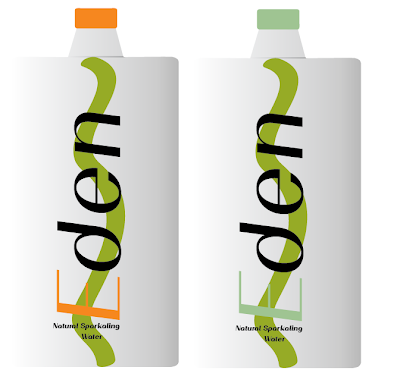
To make the design more final I changed the colour of the top to the same as the 'E' which looks professional and works, as we are wanting to add sparkling water to our brand this will help make changes so people can see the differences in the product.
When we looked at the design further we decided to look at the thickness of the line to see if the design changed at all.


Here I was playing around the lettering for sparkling, we wanted to keep it in the same place as the original design as this keeps our identity. However the next step is to play around with the font and see what the words look like in bold and in italics.


The next step for sparkling eden is the change of the colour we liked the idea of a brighter green, this I have been playing around with. You can see a dull version of the bottle which I liked at first however I think it changes the brands image, as we designed the original to have the word eden as one whereas this changes the look to two words. However the brighter more vibrant green looks better but I just need to get the right shade, however this does show the different product for the brand well.


With the different font's here I was testing how it would look and I like the top italic version as this shows the different product, we are also wanting to change the line in the background to two thin lines then one big line in the centre. However with the change of colour and background the text might look different.


 The non-bold font.


We like this for the fact if this was to go on the back of the bottle as it keeps in flow with the front of the bottle. We decided to go with the black just because it seemed easier to read than having it in the colour's.


This is the basics of our bottle the front, back and both sides. We want the bottle to be the same size each side. Our first initial thoughts are we could have the logo on both front and back then on one of the sides have a quote and then the other all the nutrition information needed on packaging. However when we start to do this part of the designing this could change, as a bit of a fun exercise we are going to print our logo and have a play around with an existing cartoon to see how it would look in real form. We can also change the size of font if we need to.

This is an example of what we might do.
After having a break from designing we had another look at the design of the logo and which out of our designs we like.
After some thought we decided that maybe the italics and darker green design was better than the lighter green overall. This was decided as the word Eden looked liked to words instead of one which could be misleading to our brand name. We decided the darker green as this made the word again appear as one word instead of two.

To make the design more final I changed the colour of the top to the same as the 'E' which looks professional and works, as we are wanting to add sparkling water to our brand this will help make changes so people can see the differences in the product.
When we looked at the design further we decided to look at the thickness of the line to see if the design changed at all.


Here I was playing with the thickness but this was a bit to far as it takes of the bottle in a bad why where it takes the focus off the logo. We want the lane to represent the river not be something random on the box.


We like both of these designs as the thickness is not to thick and works well with the logo. I could maybe make the line a little more central on the box. However when we were thinking of the sparkling design briefly we thought we could have the line on the still water outlined on the sparkling.


This design we like as its the thickness of one of the lines above on the still water.


This is the design that we chose as we think the thickness is just right for the bottle, however I want to play around with the position by making it more central and sit nicely behind the word.

On the right I have moved the design to sit behind the word more nicely which I think looks better simply because on the 'n and d the line sits more evenly. Also on the 'E' the line meets the letter more naturally.
I also think after looking at other brands out there our logo is different and stands out as well as the shape of our bottle/box.
Sparkling


Here I was playing around the lettering for sparkling, we wanted to keep it in the same place as the original design as this keeps our identity. However the next step is to play around with the font and see what the words look like in bold and in italics.


Here I was playing around again with the positioning of the word 'water' as the lettering is to long to fit exactly under the 'E'.


The next step for sparkling eden is the change of the colour we liked the idea of a brighter green, this I have been playing around with. You can see a dull version of the bottle which I liked at first however I think it changes the brands image, as we designed the original to have the word eden as one whereas this changes the look to two words. However the brighter more vibrant green looks better but I just need to get the right shade, however this does show the different product for the brand well.


With the different font's here I was testing how it would look and I like the top italic version as this shows the different product, we are also wanting to change the line in the background to two thin lines then one big line in the centre. However with the change of colour and background the text might look different.


Here I am experimenting with different colours from light greens to orange and yellow, as I wanted to get a range of colours to see what would work and what wouldn't. I still like the idea of a light green however the next step will be to change the background.


With the background changed I don't think the yellow or orange really works however I like the mint colour green so far as this seems to work best as you can't really see the pale green and again makes the word look like two words instead of one. This I will have to check with my partner but so far I think this colour works.


I have changed the pale mint colour to a more darker mint colour as I felt this made the word more of a one word then two. As the original still water is a darker green I think this colour will fit in nicely as a brand, even though they are still dark colours used the two greens work for the to different products.

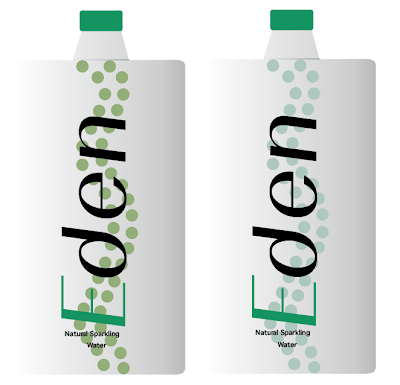
The two front bottles together.


I moved the 'water' to be more central for the sparkling water.

When designing for the sparkling product I realised that I spelt the word 'sparkling' wrong. I am glad I have figured this out now rather than later.


Here I made a few changes after speaking to Chloe, I have changed the wording to the same as the original but made the lettering bold so its not so small and little compared to the bold logo. The bold lettering works well with the logo and background it makes it more formal.


Bold font.
With the full images here I think the bold does work well as its more easier to read which is the best design you can do simply because a design isn't good if you can't read it. It's not a a big change but it has improved the design that little bit more.
After speaking to my tutor I think that looking into the background more might be a good idea simply because I think this might define the different product more. Look into maybe using bubbles to define the sparkling of the product and it helps identify the product to customers who could be shopping.

Here I wanted to try out how the bubbles would look with the different font sizes from 2pt to 0.5pt. However I do need to try this out on the design really as I quite like the 4th in on the left.

Here you can see that I have tried out 2pt and 1pt thickness I do like these as they are different and when its next to the original you will be able to see the difference.

Here I have done the same again where I have used 1.5pt, 0.75 and 0.5pt. I really like the first two on this image as I like how the bubbles work with the logo, however its weather you like the light or dark bubbles?


Here to develop the bubbles further, I have blocked the bubbles out to see how different the design would be. I think this has again worked really well like the outlined bubbles, I think the colour should maybe be different or lighter?


As I really like all the colours I tried out I wanted to see how the new colours would look with the original natural water. As they are both products for the same brand I think its good to see how they look together.

These are the two that I think work well with the original water. I like how the first bottle is the similar to the original colour just a more paler colour whereas the second bottle is more a paler mint colour. I think this is a decision that we need to make together as both work well.


Here I have added the measurements to the bottles to just make the product look more realistic.
After talking to Chloe we have both decided to go with the mint background, the above image. As both designs look good together and work well for our brand. We think that the green bubbles make the logo stand out more than the original does which isn't what we wanted, we like how the mint background works with the logo for the sparkling. As its a new brand for our existing brand.
The Other Sides

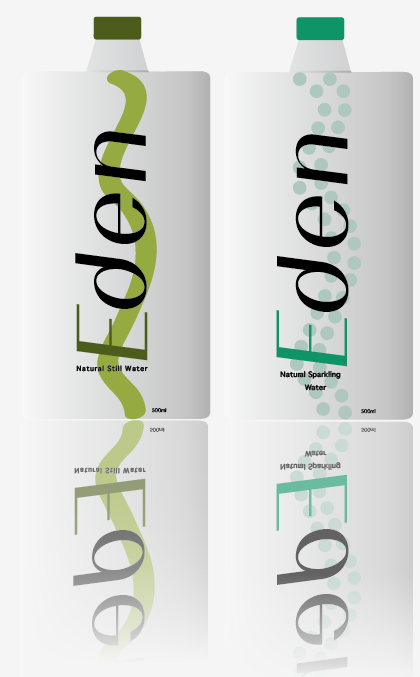
Here we have the sides of the bottle and what we want on each one. So far we think the front of the bottle should be on the back as well and have the fact on the side along with the information you have to have on the other side. However we have also thought about maybe having instead of the logo on the back as well as the front having the fact on the back but mirroring the front logo in some way. We are unsure as we will have to come up with something to go on the other side, this could be done with line or bubbles positioned differently on the bare side. However I am going to design all of this as it will make the decision making easier.


Here I have chosen the same font in bold that we have used for the word 'Eden' on our logo. This was because I wanted to mirror the logo if we were to put this on the back, I used the colour black and then the colours used for each 'E' as I think this is a nice link to logo again. As another development I added the line and bubbles to see how it would look as we might put the logo on the back.


Again I did the same as previously however I changed the position to portrait as I wanted to try it and see what it looked like. However I don't think this has the same effect as the previous design simply because it doesn't flow as well with the front of the bottle if this was to be on the back. The last image here I added a drop down shadow to see how it would look but I do think it works better without as it gives the bottle a different feel.


Here I tried the font in a without it being bold however I don't think this stands out very well as much as the bold font as its harder to read which ultimately not a good bit of design if you can't read it.

We like this for the fact if this was to go on the back of the bottle as it keeps in flow with the front of the bottle. We decided to go with the black just because it seemed easier to read than having it in the colour's.

This we liked if we were to have the fact on the side of the bottle as we thought it would work better to not have the lines or bubbles in the background as it wouldn't flow as well.
Bare Side

Here this could be used for the side that might not have anything on, we wanted to fill the space up carrying on with the background design from the front. I have just simply changed how the line and bubbles have flowed from the top to bottom.

Here this is what our bottle would look like with all the sides together, we do need to add the information on the information side however this can be added in later on.

Here we have the second option for our bottle, this is what the bottle would look like if we were to have the fact on the bottle. We will have to decide between the two and which one will work the best for our products. I think we should go for one that is easier to read and simple.


Nutrition

Here for the nutrition part of the bottle I firstly just copied and pasted the part from a websiste along with the bar code. However when I looked at this side with the other parts of the bottle I decided it would be better to rewrite it myself in the font I used for the natural and sparkling type. As this would keep everything the same.


Here I rewrote all the parts for the natural and sparkling water and overall I think this works a lot better than just simply coping and pasting. I kept the typeface the same as I said which looks better, I also changed the colour of the headings nutrition facts to each colour as this keeps the same theme going. I also changed the size that it would appear on the bottle a more smaller size which I prefer (the bottom image.)


Here are what each side of the bottles would look like together with the last side finished. I still like the first designs as they seem to work well and is easier to read for the fact.
As a bit of extra I decided to add a reflection for each side to give the images a bit more of a professional look to them and simply finish the designs off.


Her are the images of the designs with reflections, I think this has finished the designs off well and can also be used for adverts or other parts of our campaign.
Here I added to the bottle some little extra's such as the lid having a bit of ridged edge to it and having more shading to it, which has made the bottle look more 3D and more realistic.
Above is what we were planing on having on each side of the bottle.
However with some thought we decided that we should take away the quote as we felt that it was over complicating our new brand values. Our brand values changed when we thought about advertising the water as it looked again to complicated, we changed our target audience to healthy and wide range of people. So we decided to have the last side with another barcode so there wasn't just a side not used, we feel that this was needed even though at the beginning we liked the idea of having a quote it simply does not fit the new image.
No comments:
Post a Comment